Working with Fonts: Choosing Fonts to Match Your Personality
Fonts have personalities. They say a lot about who you are. My logo has always been a selection of two fonts, one soft cursive or handwritten form and one bold all caps selection.
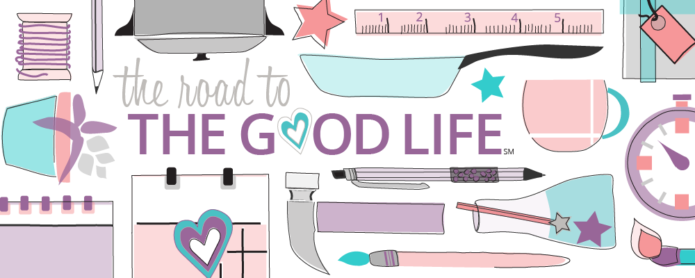
I want my logo to say: Bold. Confident. Approachable. Personable. Fun. Fresh. Uncomplicated. Easy Going. all at the same time.

When it comes to type, one thing most designers will agree upon is limiting your font choices to two or at most three fonts. Up until recently there were five fonts in my branding:
- CK Ali's Hand Official
- Big Noodle Titling
- Bododita Regular
- Georgia
- Park Avenue

My extra fonts were in my logo. These fonts were hard to let go, even though in all honesty they hadn't matched the rest of the blog in feel for awhile. (The Purdue Online Writing Lab discusses how you can determine a font's personality.)
My discomfort with my logo really grew when I attended BlogShop. In class assignments, I found myself experimenting with CK Ali's Hand Official and Big Noodle Titling. When I created the printables for my Girls Night In Thai Cooking Class, I subconsciously chose my three fonts: Big Noodle Titling, CK Ali's Hand Official, and Garamond/Georgia.
Why was it hard to release these fonts? They were the fonts from my wedding. Letting go of the fonts, meant not defining myself solely as a bride or a wife, but incorporating that role into my being as a whole.
For my logo, I really liked the contrast of a script font with an all cap bold font. To evolve the mark, I simply replaced Park Avenue with CK Ali's Hand Official and Bodidota Regular with Big Noodle Titling.
How do you choose your fonts?
What do your fonts say about you?
What do your fonts say about you?
3 Tips for Picking Fonts
Here are my tips for choosing or alternatively losing fonts:
- Familiarize yourself with general personalities for various fonts. The January 2007 edition of the Software Usability Research Laboratory (SURL) at Wichita State University newsletter presents the results of a study that discusses the perceived personalities of popular fonts.
- Steer clear of what Natalie Bowman of Bing calls "the Mom Jeans of Fonts." Fonts she recommends avoiding in her "Tough Love: What Brands Think of Your Blog" ALT Channel course are: Algerian, Black Adder, Chiller, Comic Sans, Curlz, Gigi, Papyrus, Vivaldi, and Zapfino.
- Refrain from mixing two serif fonts. If you want two fonts, a good rule is to use a San-Serif font for headings and titling and your Serif font for paragraph text. (San-serif is slightly easier to read online; as I also produce Dispatches from The Station, a hardcopy journal, I wanted a font similar to what you'd find in a book.)
Ciao Bella!
Eden!
P.S. Don't feel like commenting? Strike up a conversation with me elsewhere: Twitter, Instagram, Facebook, or Pinterest.
Credits: All layouts designed by and images taken by Eden Hensley Silverstein for The Road to the Good Life.


